If so, have a look at the first August challenge at The Studios Challenges where the DT have come up with some fabolous creations to give you some ideas.
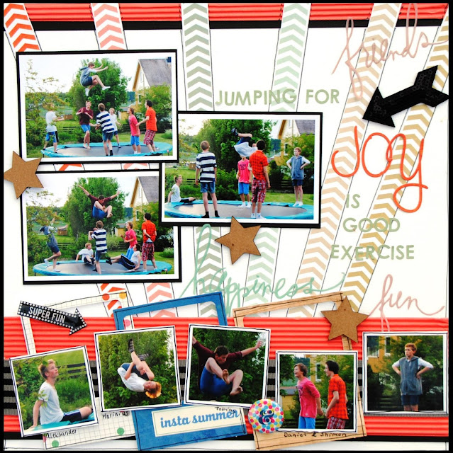
Here is my example for you, and I'll share some of my secrets below the images.
 |
| All materials from The Paper Bakery June Kit except orange alpha (Basic Grey), white CS and flair (The Paper Bakery) |
Close up photos.
Sometimes I want to tell a story and use one photo only to emhasize it - other times I want to let the photos tell the story and the journalling is kept to a minimum. My secret on how to fit more than one photo in a layout is to use 3"x4" or smaller photos on as I find it easier to come up with a good design using those sizes. And don't be afraid to crop the photos to showcase details like faces or funny jumps!
Do you do multiple photo layouts?


2 kommentarer:
Love the sunbursts effect!
I do multi photo layouts occasionally - mostly I prefer one photo pages :)
Wow Hilde this is amazing! I can't believe you got 8 photos on there. Fun photos and wonderful design!:)
Legg inn en kommentar